Showing posts with label hand lettering. Show all posts

Friday, July 10, 2015

Alice in Wonderland!


I recently had the great honor of illustrating the cover for a re-issue of Alice in Wonderland for Scholastic Book Clubs. This really was a dream job for me, since it combined both illustration and hand lettering, plus it was such an awesome subject. Not only am I a big Alice fan, this year marks the 150th anniversary of its first publication, making it all the more special to have the opportunity to work on.

I don't normally show my process but I thought I'd show my initial thumbnails I submitted. The parameters were pretty open other than that the book would come packaged with a mini pocket watch, so that needed to be featured alongside the white rabbit and Alice, of course. 

The bottom left option was the one that was selected, which was a favorite of mine along with the top left. I was pretty surprised that it was chosen, mainly since I had taken the typographic liberty of line breaking up "wonderland." The revisions were only to flop Alice and make her look older and more tween/teen looking. Basically, I just lengthened her torso, cinched in her waist and slimmed down her face and there you go! 

Because these titles for the book clubs are reproduced at a tiny thumbnail size, it need to be readable at a reduced size, so I went with a dark background to make the title pop. It worked pretty well, since Alice's descent is kind of mysterious anyway. The best part was adding some angry flowers!

Wednesday, June 10, 2015

Surtex, part 2!


So, dear readers, here is the long anticipated (if you don't know me, please insert heavy sarcasm...), part 2 of my surtex journey, this time concentrating on how we (Tammie, Emily and I) worked together as a collective in preparing for the show. 

Firstly, let me say that if you are planning on exhibiting in a group, make sure you have common goals, work ethics and individual styles that ultimately look good when shown together in the same space. Maybe that seems obvious, but the look of your booth, design, etc. should have a cohesive vibe to it...not so much where the individuality gets lost, but enough that a passerby knows the kind of art to expect. The three of us (along with the other collective members) had been together, doing collaborative projects for over a year, so we knew that we could depend on each other going in, to share the workload and work well on a collaborative basis. 

Once we committed to the show, our first design-related order of business was to put together a Surtex ad. We were all busy, so naturally, the deadline creeped up and we only had a few days to put something together. After deciding to just divvy up the allotted space in thirds, it was apparent that we would need vertical images! Giraffes, llamas and top hats to the rescue, haha. We agreed to an overall palette for cohesiveness, added some coordinating patterns at the bottom to fill the space (and show we could do more than characters...a recurring theme). Emily put together the overall design with some additional great hand lettering and we were done in about 24 hours, whew!


Our next design topic, was the booth itself. This was a little trickier. We all were of the opinion that we wanted to stand out and be different, which by our definition, meant not going the typical vertical banner route. I believed that as a collective, we had a unique opportunity to do something a bit different...we had the advantage of combining our time resources as opposed to an individual artist and yet we were not as large as your typical design studio, attempting to fairly represent a larger number of artists' work. Our booth design evolved over time and many discussions, via text, email, Facebook, google chats, you name it. Initially, we were going to feature a different character scene on each wall. The characters would be dressed in our own patterns and hopefully, could be printed on foam core, to give the walls some added dimension. The more we thought about this, the more we realized that this would really only feature characters. Being a group with differing strengths, we needed to rethink and come up with a design that could showcase pattern work more effectively. Tammie came up with the great idea of extending the "rain" theme we already had going on the character wall, with a wall filled with raindrop patterns. At that point, we felt that we would have the best of both worlds... pattern + characters = happy happy!
Wall design that was axed in favor of the raindrop wall concept.

Initial thumbnail of what our character wall might look like.

Next came the extras. Emily had the awesome idea of having a selfie wall. Since we had a corner booth with an outside wall, we decided to utilize that for selfies. That left the interior/flip side of the same wall. Having crappy site lines (we started referring to it as the "useless wall") I thought of playing up the rain theme a little more (yep, I know how to run an idea into the ground) with a fun self promo.... squirt guns (or for the politically correct crowd, "soakers"). With all the walls, spoken for, we divided up the tasks. Emily did the character background and designed the selfie shapes (we divided up the props themselves later), Tammie did a graphic plaid background for the raindrop wall and other areas, and I did a happy happy lettering pattern for the selfie backdrop along with the headers for the squirt guns. 
We each contributed our own birds as well as hand lettered names.
Credit for the Happy Happy Art Collective logo goes
to Muffin Grayson.
Now it was time for actual design and production. We never actually comped up what the final booth would look like, something that in retrospect, was kinda scary. The most we did was mock up our own areas of the walls. Emily provided the background image, and I made sure that my elephant would fit. For production, again we divided up responsibilities. I dealt with the foam core vendor, Tammie with the banners and Emily tied up all the loose ends and handled a lot of the dealings with the show itself. We had talked intermittently about hanging raindrops, suns clouds, etc. as a cute finishing touch. That idea got scaled down to a raindrop banner, hung between the poles. I found some cool colored vinyl online (what can I say... I procrastinate by shopping...) and we cut and strung together all the drops on setup day.

This was Emily's preliminary character wall background for layout purposes, She later added flowers that we each had drawn. White vinyl raindrops were added by hand at the show after we had adhered our guys to the banner.

Fortunately, Tammie was local, so we had the everything shipped to her (lucky Tammie). The only snafu was with the foam core. The company I found that could print and die cut our characters was based in San Diego. Needless to say, oversized  foam core animals with skinny appendages don't always travel well cross-country, but we gave ourselves enough time for some redo's, which we ended up needing to do. Setup day was a bit more involved than the usual hanging of banners. The command velcro strips worked really well, even with hanging our big, wall-sized banners. After cutting numerous foam core tabs to the backs of the characters and raindrops, we adhered them all and moved on to cutting out more raindrops for the various walls as well as for the banners. We decided to tackle packaging up the squirt guns back at the hotel, after we ate.

Our wild and crazy Saturday night activity... bagging and stapling up squirt gun promos!

our promo table set up... magnets, cards, postcards, stickers and pencils galore!
Emily was a pro at interacting with the passerby's!

my little shower of patterns :)

Ultimately, we were super psyched when we saw how it all turned out (so maybe we or at least I was a tiny bit worried, not having comped it all up!) The show went very well and the booth design and selfie station served as great conversation starters. Well, I think that about covers it! If you haven't dozed off by now, thanks for reading!


parting was sweet sorrow!


Monday, May 25, 2015

Surtex 2015.... part 1


Seems like the posts where you think you have the most to say, are the most difficult to begin. I am trying my hardest not to fall into my usual trap of starting off with, "Well..." Looking back at my posts, it's downright embarrassing how many times I start out that way! 

Anyway, (is that really any better?!?!) Surtex was an absolute whirlwind, from the moment I got there  and began the set up process to the last minutes of the show. I met so many great artists that I've been fans of for some time and I can honestly say, they are collectively, a wonderful group, funny, talented, friendly and just great to hang out with. Definitely a major highlight of the show for me.

I was reading my friend Lauren Lowen's recent post on her road to Surtex and it really got me to contemplate my own path. I don't have the same background, but she made me think about the how's and why's of getting to the show. I'm a graphic designer by trade...that's what my degree is and the design program at Penn State was meant to develop you into an art director. NOT an illustrator, which is why I don't consider myself much of a drawer. I still don't think of myself as an 'artist' and that's actually ok. I like to think that I'm more of a problem solver. But, when it comes to presenting yourself as an artist licensing/selling your work, it can get a little tricky. Truthfully, I never even heard of Surtex until a couple years ago, when I took a series of online classes. It opened my eyes to the possibility of working to get stuff in the marketplace, vs. working for a client. Big difference.

My first job out of college, was as a entry level designer for a major toy company. I had interviewed at a number of small agencies, but landed in corporate design. It's an area that is often overlooked by graphic design grads, but it gives you a great background in working with and for all the different aspects of getting a product to the market place. From R&D, to marketing, to upper management, to sales, packaging, copywriting, legal and merchandising departments...there's a lot to learn. I worked with a lot of brands and helped develop and apply styles (yes, I even did a few My Little Pony rump designs O_O). I left Hasbro to raise my family and I continually, in dribs and drabs, started doing some freelance illustration. But not "licensing." Somewhat ironic in that I did a lot of work for the Licensing department, developing kits that defined brands like MLP, Monopoly, Mr. Potato Head, Furby, etc. I was pretty good at creating patterns, motifs, etc. that expanded the brand for manufacturers to use, but my own brand? What was that? I worked to briefs, solved problems, came up with ideas. I never gave my own "brand" a second thought. 

So the whole concept of coming up with art that others would be interested in, was pretty foreign. Make art that sells, do what you love... huh?!? To be honest, that still seems like a stretch at times. I decided to walk the show last year, and like so many others have said, it was completely overwhelming. So much to see, learn and process. I never had the courage to take a single peep into any portfolios, just walked around. When the opportunity arose to show with my happy happy friends, even though I felt completely unprepared, I knew it might be my best and only chance to get in. Usually the one standing on the sidelines watching, instead of logically waiting and developing an appropriate amount of work, I decided to go for it. We formally committed to a booth in January, but due to other commitments, I didn't start anything until mid-March! Not a plan I recommend to anyone! I did a lot of 'refresh' on some existing work (my motto being, it's new to you! ;) Here's an example...

This was originally a journal cover that I reformatted and did some coordinates and new lettering.

Even though I walked the show, I still didn't feel like I had a handle on what to show. This would be my biggest learning curve. I knew I wasn't a "pattern" person, but despite that, I still felt compelled to do them. That was my biggest eye opener. You don't have to do "patterns." Not that you shouldn't of course, but it's not a requirement. There were very few who came to our booth that were actually looking for them. A majority seemed to be in the market for icons that they could pull out and use. And Christmas. Bring it. You can't have enough of it. It was downright shocking to us how often we were asked for that subject. I had some, but should have had a lot more. I had heard that there would be a lot of requests for boys prints, but that didn't seem to be the case for us, at least.

Another surprise was the number of publishers present. This was great for me, since it's an area I really want to get into more. It makes sense, since NYC is kinda the publishing capital of the world, but surprising at least to me, considering it is advertised as a licensing show. Again, it's not all about pattern.

What do I wish I had done more of? Just prints and lettering in general...more that could be applied directly to the paper market. What was I glad I had? Prints with an abundant number of characters. It gives the buyer more bang for their buck. Can't have enough of that. What do I wish I had done? Send out show stopper self promos. Even if it is only to a handful of very select dream clients, if you do it well enough, you can really stand out and get noticed. Case in point...Emily's pennants! Who could resist or forget these beauties?


What was I glad I did? Show up. There's nothing like it. Where it all leads, remains to be seen, but it all went down pretty well and I'm excited about what happened and what might happen next! Stay tuned for part 2 when I talk about booth design and showing with a collective :)


Sunday, April 19, 2015

storytime magazine


I must say, over the past year, I have been extremely fortunate, having some wonderful opportunities just land in my lap. An illustration job for Storytime Magazine is no exception.  Truthfully, I had never seen this magazine before, mainly due to that fact that it's new and does not get US distribution (hopefully that will change!) It's soooo gorgeous, filled monthly with lovely illustrations from many of my favorite artists, printed on a quality matte stock, and NO ADS! It kind of reminded me of the old Ideals magazines that I remember reading with my Gramma, growing up.... full of full bleed pictures and wonderful stories and poems. Right now, there really is no other periodical like it here in the states that I know of. 

just look at that gorgeous cover illustration by Chiara Nocentini!

I was contacted by them back in January. I was super swamped at the time, but really wanted to do it, and they were kind and flexible enough to accommodate me. I have always wanted to get into editorial, so having my first job in this area being with a kid mag, really made it ideal. The story was so sweet...an ABC poem. It was just so old fashioned and cute, I knew right away that I wanted to give it a retro limited color palette. I had to hide all 26 letters of the alphabet within the 2 main illos (can you find them all?), plus design a simple alphabet that corresponded to the poem. Actually, in the back of the issue, they used to letters to make a board game. Fun! 


If you live in the UK, it's definitely worth subscribing to, whether or not you have kids. I was super honored (and completely surprised) to be included.


Friday, February 27, 2015

samples, samples samples!


one of the funnest (yes, that's right, I have the vocabulary of a 6 year old..) things for an illustrator is when a package arrives in the mail with your samples! I've had the pleasure of working with Peaceable Kingdom Press over the past year and these are a few of the projects I have completed for them. The colors turned out great (much cleaner than my crappy iPhone camera can show) with die cuts and the pink kitties are actually flocked! 

Monday, February 9, 2015

trying to keep it springy...


...as another foot of snow falls on top of 50 plus inches that have fallen over the last few weeks. Oh and just so you know, shoveling with 2 bickering teenagers is loads of fun!

Anyway, I did this card for Peaceable Kingdom, available as part of a nice boxed set :)

Friday, February 6, 2015

snowed in.


heyyyyyyy, so long no post! I could legitimately say that I have been snowed under. I mean if you are familiar with what has been going on with new england weather the last 2 and a half weeks, we have gotten over 50 inches of snow. NOT a typo. aaannndd, there is another predicted foot plus on the schedule over the weekend into Monday. I know a lot of people love snow and wish they had more, but TRUST ME. No one wants this much and no, it has not made me as happy as this little kiddo


Anyway, on the positive side, it's forced me to stay home and work and there's no shortage of that. I've been wrapping up some projects and starting new ones. The card above is one that I did for the nice folks at Peaceable Kingdom. I haven't gotten a sample yet, but it's die cut, so that's pretty cool!

More to share soon. If you are a north easterner, happy shoveling! grrrrrrrrrrr.

Sunday, December 14, 2014

the power of santa... freebie download!


if you've ever been around kids with less than 2 weeks to go before Christmas, you know what I'm talking about. Sheer pandemonium, chaos, Christmas crazies… need I go on? Desperate times call for desperate measures and there is no more powerful parental behavioral tool than the big man himself. Creepy as it may sound, they all know the song..."better watch out, better not cry, better not pout, I'm telling you why…" Use the power of Santa! Hang the chart and keep track of all the good stuff,  reward them with stickers and watch the tree get decorated as your sanity returns! Then leave the chart out for Santa to see while he eats your milk and cookies and maybe he will even leave his autograph! Head on over to happy happy art collective where you can download the files here!

keep track of good deeds with tally marks!

for every 3 tally marks, let 'em have a present or star sticker!


hopefully, by Christmas eve, their tree will look something like this!

Wednesday, December 10, 2014

at long last… DAY 40 of 40 DAYS OF LETTERING!


This was one of those projects where maybe I should have made it more like 30 days or even 20. I'm embarrassed to say how long this thing has gone on! And by the end, I felt like the last one should be some sort of momentous grand finale of sorts, making me procrastinate all the more, which was hardly the intent of the whole thing in the first place! Instead, I've just settled for an ending… grand or not. Anyway, I'm glad I did it, but more glad that I finished it (finally….)

Saturday, December 6, 2014

get your freebie santa fortune teller!


Here's my contribution to happy happy art collective's 24 days of free holiday downloads. 
Head over there to get your freebie and see what Santa has in store for you this Christmas! 
(here's hoping it's not fruitcake…)

Sunday, November 30, 2014

announcing 24 days of FREE happy happy holiday printables!


The artists of happy happy art collective will be having a free daily download, starting tomorrow December 1st! (crap… tomorrow is december 1st. how the heck did that happen?!) Anyway, make sure you bookmark our blog and like our Facebook page so you can be sure to keep up with the goodies!

Wednesday, November 26, 2014

happy thanksgiving!


giving my extremely rusty paint skills a go, but wishing you a happy turkey day :)

Wednesday, November 19, 2014

holiday tunes


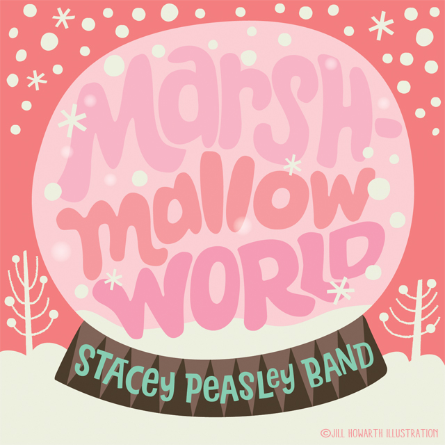
Have you started listening to Christmas music yet? Well, thanks to my 14 year old son, I have. Yup, I have raised him right. He's been streaming Pandora Christmas stations since the day after halloween, so when Stacey Peasley needed some art for a couple of holiday releases, I was ready. Prediction here… since Target has latched on to Marshmallow World for their holiday commercials, it's going to run through your head for the next 30 plus days. I know I can't get it out of my head...


Monday, November 3, 2014

Spoonflower 2015 tea towel calendar


well, I've never been a spoonflower person, if there is such a thing…always intimidated by the whole technical mumbo jumbo of creating perfect repeats. I get the general principle of it, but creating seamlessly flawless ones…errrr never had the guts to upload. Anyway, a tea towel contest sounded far more appealing or at least doable. So here is the hat I tossed into the spoon flower towel contest. When in doubt #putabirdonit. If you like, I'd appreciate the vote ;) thanks!

Friday, October 31, 2014

keep it freaky


Before the night is over, here's one last halloween wish. Personally, I've seen enough sugar skulls and day the the dead stuff, to last me a lifetime. But have no fear, once that clock ticks past midnight tonight, you will wake to jingle bells on the radio. 

Hope you saved enough of the good bars for yourself ;)

Tuesday, October 21, 2014

new york, new york


…"the Bronx is up and the Battery's down, the people ride in a hole in the ground." Know the song? Being a fan of old movie musicals and New York, it's one of my favorites. Anyway, I wanted to add some more lettering pieces that included photographic backgrounds to my portfolio. It seems to be a pretty popular style lately, so why not? I took this pic a few years back from the top of the Empire. It was a bitter cold day in December, but we inadvertently timed it just right to see the sunset while we were up there. My basic idea here was to make it look like some sort of an ad for NYC tourism. Hopefully, you got the idea before I spelled it all out! The heart it in the lower right corner, is a play on the infamous, "I <3 NY campaign. Sorry Mr. Glaser!!

Tuesday, October 7, 2014

inktober!


Yep, I've jumped on the inktober bandwagon. Ink has never been my thing, but I'm kinda enjoying it for a change from the pencil to vector routine, a.k.a., rinse dry and repeat! So far I've been using a pentel pocket brush, tomboy brush marker and a rapidograph (#2…look it up kids ;). Not sure if I will get sick of it, but I'm sticking to a halloween/fall theme for as long as I can stand it. How about you? Are you doing it? Please leave a comment so I can follow your progress (if I don't follow you already!). I'm pretty much only going to post on instagram @zippyboro… there's also a link on the right column here. Happy inking!! 


Thursday, October 2, 2014

happy happy W and alphabet bloopers


Well if you follow happy happy art collective (and if you don't, why don't you?!?!), you know that we are at long last, nearing the end to our collaborative happy happy alphabet (check out the entire gallery of letters so far right here!). It's been a really fun project, seeing what cleverness my happy buddies come up with week after week. This month, I was assigned the letter "W" and I thought, great, no biggie…should be lots of good possibilities, it's not like "X" (which happens to be my next letter, ughhhh), or so I thought. For my contributions, I've continually tried to do something a little unexpected, i.e. not your typical kid's alphabet letter images, so doing a whale was not in the cards. But maybe it should have! I kinda struggled to come up with something clever and believe it or not, here are some of the things I considered doing. Let's call them bloopers:

1. My first stupid thought was to do Washington. As in George. Standing on a map of…..wait for it…Wisconsin?! hmmmmm. Seemed so cool at first. Moving on, but keeping with the same theme…
2. Washington as a witch. Seasonal, right? errrrrrr, yeah. No.
3. Washington eating watermelon…"Ever wonder if Washington wolfed watermelon with his wooden teeth? ooooookkkkkkkay. Maybe not.
4. A witch eating watermelon. Not a horrible idea, but we have a predetermined palette we have all been using for this alphabet, and with no green at my disposal, I wasn't sure I could pull it off.
5. Something involving waffles. Hey, I like eating them, but drawing them, not so much.
6. A woman wearing a giant white wig, with lots of W words stuck int it. I was intrigued, but wasn't sure how it would immediately look like a wig vs. just a crazy white hairdo? hmmmm… which brought me back to…


7. WASHINGTON WEARING his WHITE WIG!!! With WOODEN teeth!! With a WOODPECKER WHITTLING away at it! And a WORM sticking out!! GENIUS, right?!?!?!? Well, I thought so and actually worked up several sketches. And then, I showed my art director. One look from my 14 year old daughter and aspiring designer, and she said, and I quote, "You have lost your mind." Completely serious and walked away in silence. Crap. Do over.

So this is where I ended up. I took the woodpecker and thought about who he could marry in the wintry woods and who else could be in attendance. I thought about a woodchuck, but I don't think everyone has a visual picture in their heads of what a humanized woodchuck looks like, so I went the worm route. I thought this might be kinda cute considering he might be in the bird's food chain, plus he could be small, letting the happy couple be the stars.

So, there you have it. How I got from point A to point W. Now on to the cursed letter X. I still think I should have gone for Washington… what do you think?

Sunday, September 28, 2014

day 39 of 40 days of lettering and yet another competition...


I thought I was at the point where I had had enough of these competitions and I really do feel this way. I see little point in entering something where there is a very slim chance of winning, unless of course, you feel like you would be adding something cool to your portfolio. The winning part… not very likely and certainly not worth getting invested in. Soooo, with that in mind, I entered another tiger print comp, hahaha. Well, as you may know, I love Christmas and this contest having the focus on lettering, I thought I'd just do one submission. Besides, I could use it for the second to the last day of my 40 days of lettering thing. Yes, I think I'm just continuing to type on here to convince myself ;)

It was kind of an odd contest for them. They provided around 4 or 5 photographs that you were supposed to choose from and then add your lettering. I decided to take part of a lyric from White Christmas (yeah, I am a Christmas music freak, too). I tweaked the background image, making it bluer and giving it a bit more tone for the white lettering to drop out of. I kept adding more little swashes and flourishes until it looked done. I'm pretty sure they will go for a more calligraphic treatment, but it was a nice exercise, nonetheless.

Saturday, August 30, 2014

"Cute Characters" for Tigerprint!


I decided to enter the Tigerprint competition for "cute character." I never have much luck at all in these competitions, but this one appealed to me. I mean if I call my stuff shamelessly cute, if not this contest, then what?! Anyway, if nothing else, I have a couple new birthday card ideas for the portfolio, so nothing wasted! Which one do you prefer?