Showing posts with label Lilla Rogers. Show all posts

Wednesday, September 10, 2014

Artists Around the World Blog Hop

I was recently very humbled to be asked to take part in a blog hop of artists from around the world. One of the great benefits of having enrolled in online courses like MATS, is the chance to get to know and connect with other designers and like minded artists. The lovely and talented Antonija M. was kind enough to write a bit about me and some other great artists on her blog. Now it's my turn to go on about her! 

I had never met anyone from the country of Croatia, but if she is any indication, I would sure love to visit there some day. We have been MATS buddies since the inaugural Part A of the spring of 2013, all the way through 2 Global Talent Searches ( she was Top 50 last year!), Part B, and Bootcamp. I have come to rely on her keen and thoughtful eye throughout our shared design experiences, as have many other artists. Her designs are instantly recognizable with their clean lines, sophisticated palette and super stylized, yet super cute characters. That's an extremely difficult combination to achieve, but she excels at it, while being a complete original. Just take a look at her amazing work…


She has also designed and developed her own brand lil' ledy, which she plans to debut at the Brand Licensing Europe Show in October. Her description of the brand as "Japan meets Sweden. Kawaii merging with classic harmony" is perfect and I can easily imagine her lil' ledy character on a wide range of product. I can't wait to hear and read about her success there! Be sure to check out all her work and her blog as well.


Ok, now is the part of this blog hop format where I have to talk about myself (ugh) and answer the following set questions. 

1. What Are You Writing/Working on? Well, I've been working on some cute cards for Peaceable Kingdom, developing some little characters for a shop, getting together some pieces to submit to companies, trying to remember how to paint, unsuccessfully entering design contests ;) etc., etc. Here's a sneak peek at a baby card…


2. How Does Your Work Differ from Others in Your Genre? hmmmmm…that's the 50 million dollar question, isn't it? I'm a firm believer that there's not much out there that hasn't been done before. If you don't believe that, perhaps you haven't heard of this thing called Pinterest ;). That being said, every artist needs to develop their own approach/style to have any level of success. I'd like to think that I can put a fresh slant on the mid century illustration that I love. I always try to inject some happy-go-sweet-unabashed-cuteness into my work. Does that make me unique? No, but I hope I do it in such a way that my work is recognizable.

3. Why Do You Create?  I dunno, but I've done it since I was little. There is always something about that rush to see what you can come up with and how it will turn out. I just like to make cute stuff! How's that for an in-depth answer, haha.

4. What is your creative process?  Because my background and degree is in graphic design, I tend to take more of a problem solving approach especially if I've been given a brief. Who's the audience, the message, the best way to visually communicate this, and so on. I'm not a trained illustrator, so I don't just sit down to draw before I have an idea of where or how I'm going to solve the problem. Lilla's technique of getting her students just to sit down and draw first has been a hard road for me to follow, but it has paid off, and I now actually use a sketchbook, and I love it! Anyway, I like to think it through first (like when I'm driving or in the shower…my mind tends to wander and I can think more openly. No, it hasn't caused any accidents, but I tend to forget some turns along the way!) Then I get to any necessary research followed by pencil sketches which I usually just take a pic of with my phone, and bring into illustrator on my laptop. I usually redraw everything there (that's the super tedious part) but lately, I've been trying to incorporate some traditional media into my work. Finally, I do my favorite part, add color, followed by texture, all in AI. Just a stubborn vector girl here. That and I'm not comfortable in photoshop.

Ok, more than enough about me. Let me introduce you to two wonderfully inspiring artists that you no doubt already know about… they are that good!

TAMMIE BENNETT

Tammie is one of those people that I find inspiring on a number of levels. We met through MATS and the happy happy art collective, which I am proud to be a member of, was her brainchild. She has the guts, intelligence and tenacity to take on any task…whether it be going solo at Surtex, to designing a pattern a day for 365 days…. (yeah, you read that right), to her tiny thanks project, 50 asks, producing great pieces traditionally as well as digitally, the list goes on and on and I haven't even talked about her art. Tammie has an uncanny ability to think in terms of pattern, but it doesn't end there. Her colors are so fun, the graphics, so brilliantly joyful… it's an irresistible combination.With degrees in journalism and a law school graduate, believe it or not, she is a self taught artist! I really don't know how she does it all and continues to do new things. Be sure to check out her website and blog for more inspiration.


Tammie got our happy happy alphabet off to an awesome start with the letter A! 


DENISE HOLMES

Another member of the happy happy art collective is the charming Denise Holmes! Ever since I first saw her work in MATS A, I have been in awe of her innate ability to infuse pure charm and sweetness into every thing she creates. I so admire how she has developed her own instantly recognizable style. She recently illustrated her first children's book and it should be on every parent and illustrator's "must have" list it's that good! You can pick up a copy here!


I just love her distinctive line work… always just enough, always just right, and her innate use of color is a big part of her signature style. I tend to go a bit overboard when it comes to color and I know I could definitely take a pointer or two (or four or a whole lot more…) from all her work. I don't have a crystal ball, but I have no doubt there is a long line of books in her future, her style is just so sweet and clean with a fresh vintage vibe that I adore. You immediately know when you see a niseemade piece!

this letter T is one of Denise's contributions to the happy happy alphabet… how cute is this?!


Please be sure to check out her website and blog for more cuteness!

Well that concludes my officially longest post ever! It was a pleasure to share the work of these talented artists!


Tuesday, August 26, 2014

Global Talent Search 2014


I really can't believe that it has been an entire year since the first Global Talent Search. It's funny, I really had no intention of entering last year because I knew I didn't have a chance, but when I heard the subject matter, "vintage playground," I couldn't resist. Besides, being a first time MATS student, the entry fee was waived, so I figured, why not? I put a ton of time into it… not saying that that necessarily showed, but I was one of the fortunate ones that made it through that first round. 


It was a great journey and I learned a lot about what it means to put yourself out there, which in the world of art, is a scary but necessary step to any level of success. When the opportunity came around again, it was one of those things that was hard to resist. I knew I would miss being part of it all, regardless of the outcome. Unfortunately for me, the timing was terrible. The brief was to come out the day after I was on a family vacation and I would be left with 24 hours to do it once I was home. I decided to just go for it in the hopes that I could come up with something anyway.

The brief itself, little terrariums, wasn't exactly in my wheelhouse. I like to do stuff with characters and this seemed more suited to those who work more with botanicals and flowers. Plus she mentioned paint. ugh. Plus she categorized it as "wall art." ugh. I knew I was in trouble. 

With limited time, I tried to stick to what I'm most comfortable with (vector) and tried to make it more of a little environment (a.k.a. world) and of course, meant for kids. I decided to include a waterfall and castle, as opposed to filling it with various plants and flowers. Not that I don't love plants and flowers, but there are soooo many people that do that better than me. I like the palette I ended up with, but I still question why the heck I made the little people green. I mean what kind of martian pea pod did they escape from?! Or are they just from the Emerald City? who knows?!?!?! These are the things that you don't have time to consider when you're doing a project from start to finish in one day. I'd show you my sketches, but they are even crappier than usual and I'd be too embarassed!

Anyway, even though I didn't make the first cut like last year, I am glad I played along and entered! There is always something to be learned. I'm happy with my piece, but I would have loved to develop it further, especially in terms of rendering, textures, real paint, etc.Best of luck to the final 50, many of which I know from MATS courses! Amazing pieces one and all and enjoy the journey!

Tuesday, July 22, 2014

MATS Bootcamp final assignment…have a cuppa


July marked the last assignment for Lilla Roger's #makeartthatsells bootcamp. This particular brief was a bit of a departure from the ones prior. We were to make some art that we would like to hang on our own wall or give to a friend, that had to do with a favorite beverage. I'm not one to give or hang my own work, so this one left me stumped for a while. Eventually, I settled on doing a lettering mishmash…more is more, right?!? I can only hope, haha. It came down to crushed ice or coffee, so I settled for my morning must-have, since I didn't think I could do a whole lot with ice. I started by brainstorming a list of as many different coffee related phrases as I could think of. It became pretty long list and surprisingly, I ended up using them all. I decided to use "have a cup of awesome" as the focal point of the lettering part, and went from there, fitting each phrase around each other, like putting together a puzzle. As you can see from my sketchbook, it's a pretty ugly process as I just kept erasing, fitting, adjusting, etc. until I got it to a point where I traced it over. 

As you can see, at one point, I considered having a guy drinking from the mug.

My original plan also included having these two little cameos of my coffee dude on both sides of the cup at the bottom. The best laid plans don't always work out…not only didn't they fill the space quite right, it was just adding too much madness. I couldn't axe them entirely, so I kept the bright eyed one and slapped it on the mug. This left me with some space to try and pretty it up, so I researched what a coffee plant looks like, and added those super simplified branches. I doubt anyone would recognize what they represent, but they soften it up overall. Color-wise, I was originally going with a brown background, with multiple colored bright lettering, but it was way too crazy. I started toning it down and accidentally made the background a soft aqua, and I really liked it, so I kept going with it.

Make SURE you check out the gallery for tons of amazing pieces!!


Tuesday, June 24, 2014

Lilla Rogers MATS bootcamp June assignment


The June assignment for Lilla's bootcamp was to produce a nautically themed wall art piece. Now wall art is not an area I have typically ever felt my stuff was appropriate for. I well remember when I took MATS part A last spring, the wall art week was the week that really freaked me out, mainly because it was supposed to be an abstract collage piece, preferably done non-digitally. We were given two colors based on our horoscope and went from there. I had pink and yellow and ended up submitting this below, which while not abstract, it was at least, a "collage." Frankly, I was just happy to have gotten through the week with something to submit!

This time, the parameters were a bit looser in terms of media, but the mini assignment was to draw ships in bottles and other nautically themed icons. So, I did a bunch of crappy sketches and ultimately ended up using one anyway… the first one I did of the ship. As per usual, I did everything in illustrator, messing around with transparency, brushes and generally grunging it up at the end. I knew I wanted to incorporate some lettering and in trying to come up with a nautical phrase, "sea the world'" popped into my head. I'm sure the phrase itself has probably been used before, but I thought it would lend itself to a kids piece…the direction I knew I would go in. I thought it would be cool to show the curvature of the earth, given the title. The dolphin idea was kinda like having a reindeer pull the sleigh, ha. I almost (really wanted to) add a mermaid sitting on the back of the boat, but thought it would be a bit too much. If it had been a longer poster format, I definitely would have added one waving to him in the ocean, haha. I added the houses on a curve at the bottom to counter the curve at the top and this is where I ended up. In the beginning, I was hoping to give this a vintage travel poster feel, but ultimately, particularly given the square format direction, per the brief, it looks more like a kid's book cover. I'm ok with that, even though it is probably not considered your typical "wall art" piece.

Check out the rest of the boot camp gallery here. This month featured a lot of really strong pieces, enjoy!

Friday, May 16, 2014

#doodledream book launch blog party!


A few weeks back a good friend who I had met through Lilla Rogers' MATS courses, asked me to contribute a piece to launch her new book. Jenipher Lyn has written an honest, heartfelt book to help teen/tween girls navigate their way through those tough years. The book is so encouraging and chock full of her sweet doodles, I highly recommend it! Here's what she has to say about it:


"I wrote a super honest, encouraging, vibrant book with the intent to help others [especially teens!]
 feel less alone in this world. By using MY story, and LOTS OF colorful illustrations, I want others to realize they aren't alone on those dark, lowest of low days! This is my doodle dream!" Check out her blog Nightly Doodles, for more inspiration and sweet art.


The topic she asked me to come up with something for was "being yourself." To me, that's really the key (and certainly easier said than done) to being happy. Once you are comfortable in your own skin and not trying to act like others in the hopes of them liking you, you wiill be so much better off. Eventually, others will respect you for it and like you for who you are! Moral to the story? 
Just. be. you.


You can order the book directly from Jenipher here! It is also available for purchase on Amazon. Happy reading, doodling and dreaming!


Monday, April 7, 2014

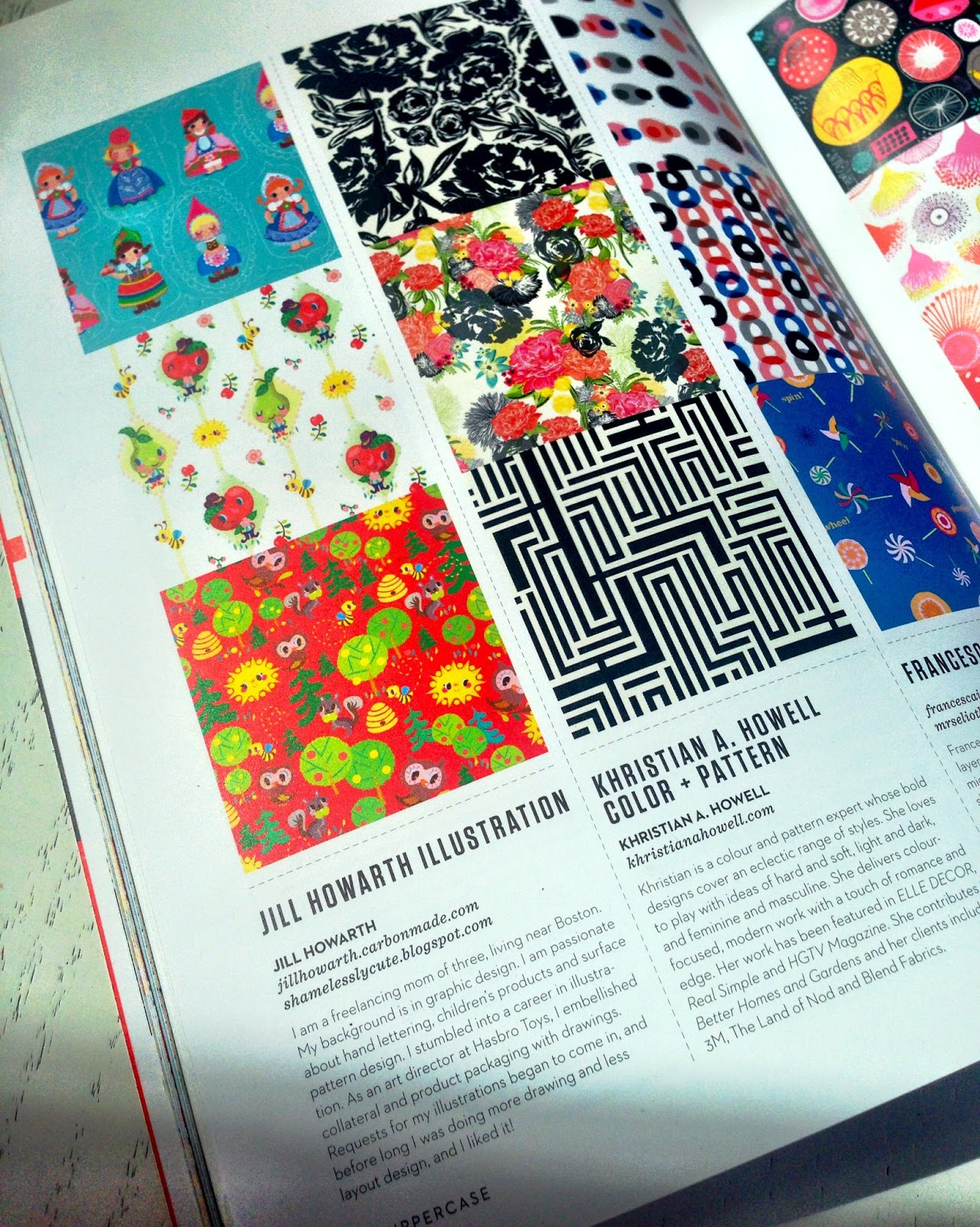
uppercase :)


I finally got my copy on Friday and I must say, it still seems surreal. I submitted on a whim at the last moment, figuring I had nothing to lose and to say I am humbled at being included is a huge understatement. I had done the middle and bottom patterns as an offshoot of my second round submission for the GlobalTalent Search, last fall and the top piece was an extension from the final assignment from MATS A for giftware, as you can see below. 


I gotta say, when I look through all the pages of loveliness and then get to mine, I still get a "what does not belong here?" moment, but I'll take it. It's not flowery or super graphic in nature, but kinda goofy like me, so I guess they needed a dose of that in the issue. What can I say, but now my silly anthropomorphic flirtatious pear has now had her thirty seconds of fame, and that's a good thing :)

Monday, March 31, 2014

Lilla Rogers' bootcamp...jello?!


I have to admit, when Lilla gave us the theme for March's bootcamp assignment, my thoughts along with the general consensus of the other participants in the classroom was whaaat?? Jello... and on bolt fabric seemed like an odd fit, but like all the assignments Lilla doles out, it's up to you to run with it as you see fit. Many others focused on the intricate molds, the fun translucency of it, or gave it a tea and dessert feel, many of beautiful pieces and approaches. Here is a link to the gallery that is super fun to browse through. For me, being a lover of all things vintage kitchen (yes, I have a large collection of cookie jars, pixieware condiment containers, tablecloths, etc.) going the retro 50's vibe seemed the most natural fit for me. For whatever reason, I stumbled onto vintage tea towels on interest, which really sparked my interest. They are always fun and kitschy, and are great examples of the use of limited palettes (something I always find extremely challenging). When I saw this pretty pink western themed example, I knew I had the beginnings of my palette. I don't think I've ever used that drab green, but I really like how it plays off of the pink and raspberry colors.

After the February cuckoo assignment, I decided I wanted to maximize my final design as much as possible, so I thought of incorporating a little kitchen scene onto my presentation. Hopefully, it does not take away from the main fabric print behind it. I really enjoyed doing the limited line and fill look that I've seen used in illos from the 50's, so this was my little ode to that era. In retrospect, it looks a bit more like a cookbook cover than bolt fabric, but that's ok I guess. I added teapots, pyrex bowls, spoons, etc. because that's what I think of when in regards to making jello. 

Like lots of kids, I was raised on the stuff. My mom had it as a side and almost considered it a salad (as opposed to a dessert) for many meals. Her usual formula was to dump a can of fruit cocktail in it for added nutrition ;) I can still taste the texture of those horrible hairy gooseberries...ugh! In fact, I found this photo below as an actual example! Note that I have to be at least 5 and am still in a highchair....hey, when you have to fit 7 people into a 10' x 10' kitchen, you take any seat that's available! I was a picky eater, and apparently did not want any part of "make-your-own-sub-night!" Gotta love those knotty pine cabinets, don't you?


Monday, March 3, 2014

Lilla Rogers' Bootcamp... gone cuckoo!!


Month one in Lilla Rogers' Bootcamp has come and gone, along with February, so I thought I'd give you a quick recap! First of all, I wasn't sure at first whether or not to sign up for this course, but somehow I knew that once I started seeing all the beautiful pieces coming in, I knew I would want to get in on the action. I work better with a brief anyway, and bootcamp is a more affordable option to Lilla's classes. If you have been on the fence about taking one of her MATS classes, this is a good opportunity to get your feet wet. The schedule is much more spread out, with a week for the mini assignment and then 2 weeks more to develop the final and upload it on the gallery on her studio site. In MATS, you have less than a week to do the same thing, so time seemed like a luxury.

Being a natural born procrastinator, no surprise I abused the time frame and essentially did it in a week, but somehow, it seemed far less stressful than MATS. I actually really liked the subject matter of cuckoo clocks! Being a collector of all things cute, german and wooden (a.k.a. smokers, wendt & kuhn flower children, angels and various other bavarian kitsch) , it appealed to me. We had a cuckoo clock in my house growing up. Can't imagine having one now with the chiming and cuckooing in the half hour, but you do get used to it. 

here's a little peek at my WIP in illustrator. I did everything in it.
The challenge came in when Lilla defined the end piece as a cell phone case. Cuckoo clocks are loaded with rich details, so it was hard to imagine how it would all translate well down to a such a small format. I played around with some different ideas, like turning it into a skyscraper type condo bird house, not unlike the ones you can buy for purple martins, or possibly making a city scape out of different clocks/houses, but in the end, I decided to focus on the birds. My thinking was that it might be a good way to fill the vertical space of a phone case and besides, birds are cute and fun to draw. As far as style, I went for a symmetrical folkloric look, kind of like the party paper assignment at the end of MATS B. What can I say, I'm a sucker for symmetry ;) It was fun to try to give some of them a little personality. 

The gallery of over 400 cuckoo cell phone cases is amazing. A ton of great pieces, so if you have the time, check it out here.  Enjoy!!


Wednesday, December 4, 2013

Lilla Rogers, Make Art That Sells, hometown map assignment!


I realized that I never officially posted week 4 editorial assignment from Lilla Rogers MATS class. This was a particularly challenging assignment to do in less than a week. We were to do a map of our hometown. Now I presently live in a typical New England small town, just 30 some miles west of Boston. I actually considered stretching the truth and just doing Boston, but ultimately I decided that doing a map of a city would be more overwhelming, especially since it has been done so many times already. I seriously doubt that little ol' Westborough has been the subject of an editorial map. 

The disadvantage of doing a small town is the seemingly lack of interesting subject matter, so I dove into the history books to get some material! Although he left here as a small child and his family's home is long gone, Eli Whitney, the inventor of the cotton gin, was born here! Also, in the 19th century, Westborough was known for sleigh manufacturing. Outside of that, I decided to focus on the hellish traffic circle (the rotary) in the center of downtown, with no less than 7 streets converging into it. To make traffic worse, nearby there is a low railroad bridge that despite multiple warnings, tractor trailers get stuck underneath it on a weekly basis. Fun! Since it is in New England, the epicenter of the Dunkin Donut chain store magnate, there is an odd, unhealthy abundance of donut/coffee shops. I counted 9 in a town of 18,000. Seems like a pretty high ratio, but maybe the sugary caffeine rush is necessary to navigate through the downtown traffic ;)

I have always wanted to tackle a map and despite the challenge, I was thrilled that this was the assignment. My class submission is the smaller version pictured below. I wanted to submit this to the wonderful site, They Draw and Travel, so I had to expand and reformat to meet their horizontal specs. There was a lot that I did not have time to do for the class assignment, so I took the opportunity to add more buildings, people and of course, the infamous railroad bridge. There are always more details I would like to have added, but this kind of work is really an exercise in editing it down to a manageable amount of info that gives the viewer a feel for the locale, without showing every last detail. I hope I achieved that!


Monday, November 11, 2013

Lilla Rogers Make Art that Sells... party ware!!


Well, it was the fifth and final week of MATS, that focused on party goods. I never gave this market much thought...who really thinks about disposable paper goods? But I can see the potential for fun design in this area, with all the coordinating table products that are needed, not to mention, gift wrap. 

Our assignment was to create a design for a paper plate and napkin with a Bavarian/Ukranian folkloric theme. When you look at this type of art, there are a lot of florals, which initially, made the brief kind of intimidating to me. There are many artists that specialize in floral/botanicals, but I am surely not one of them. Instead, I tried to take a more figural approach which really ended up looking a bit more storybook. I thought it might be fun to do a cottage and the animals sprang from that. I started out by using some symmetry with the squirrels and trees, but then I remembered how a lot of the little wooden german figurines that I love to collect, often are playing instruments, so I threw in the violins and mandolin. Birds are also a predominant part of this type of art, so I decided to feature a couple of woodpeckers to add some interest to the trees. The girl was a must, of course. Initially, I thought I was going to go with bright colors... kelly green, bright blue, warm red and pink, etc. much like the German pieces I was speaking of earlier, but once I made the grass pink, there was no going back and I ended up with a somewhat limited palette...always good practice for me. And hey, what's wrong with a little pink grass, right?

I must say, I really enjoyed this course. The tight deadlines, great themes and inspiration topped off with being part of a wonderful community of super artists all contribute to the creation of so much incredible artwork by my fellow classmates. I highly recommend it!

Sunday, October 27, 2013

week 3 of Lilla Rogers Make Art that Sells...scrapbooking


Time is flying by and we are already at the halfway point in MATS. This week concentrated on the scrapbooking market. Our brief was to design a scrapbooking page (the kind you might see in the aisles at Michael's) with a vintage camera/typewriter theme. The mini assignment (given out at the beginning of the week) was to draw those two subjects. Now I would never consider myself to be any kind of a great technical drawer, so the thought of taking my pencil to represent typewriters, in particular, was a daunting task. There are a lot of people in the course that can literally draw or paint anything with great ease...I am not one of them. Nonetheless, I liked the subject, especially the cameras, so I gave it a go. The first thing I saw were faces amongst all the buttons, bulbs and lenses, so at that point, I had my direction...vintage robot cameras, sort of! It made the project more fun. We were also told to include some lettering, which I was very happy to use to fill out the page. I also introduced the idea of using CMYK colors and registration marks. I thought they might add a nice touch as a border treatment. I drew a lot of cameras, many of which didn't make the cut, but my favorite little guy, was a quick little doodle/afterthought...meet mr. instamatic! Maybe it's because instamatic cameras, while not the most interesting looking cameras of all time, were the kind I used as a kid until I tried to get all fancy with a 35mm in college. Remember the film cartridges? I made a little pattern of them up near the top of the page.

It was a fun week and once again, a real pleasure to see all the different translations of the brief by the talented members of the class. Next week is one that I have been looking forward to...editorial!

Tuesday, October 22, 2013

Week 2, Lilla's MATS class... baby apparel


Our week 2 assignment was to delve into the baby apparel market, focusing first on camping, in particular vintage camping as in retro campers, etc. I've never really focused on going into this market, even though I have done a lot of brand licensing work meant to be applied to apparel. I have never really come up with my own designs as applied to kids clothing. As with every week in Lilla's class, we get a mini assignment in the beginning of the week, in this case, camping icons. My main issue was that I came up with too many! I eventually settled on a woodland animals type camping scene, but as you can see from some of my sketches, a lot of them didn't make the cut! It's always a challenge for me to limit my colors, but is is a good exercise and contributes to a more pulled together look, I think. I may have gone over the line (10 colors) but lets just say there are a number of tints here ;). I used line work to try to hold the icons together, somewhat, without filling it up, so to speak. I could have done a whole lot more coordinates. I find that aspect of surface design the most fun, when you get to expand upon your theme. Next up is scrapbooking...stay tuned!


Monday, October 14, 2013

Make Art That Sells... Christmas in October!


Well it's that time again... the Christmas decorations are out nudging the Halloween decor in Target and I have yet to rake a single leaf! This week marked the beginning of part B of Lilla Rogers Make At that Sells e-course. I took part A and learned so much and have been looking forward to the topics in the second half, the first of which was the paper market. The assignment was to come up with 2 Christmas cards, focusing on candy and vintage ornaments... two of my favorite topics :). I have always been a big collector, and vintage Christmas is a major obsession...just check out my mantle. It's all there, from old cards, to hard plastic light-ups, to vintage Japanese ceramics like Holt Howard, Napco, etc. alongside Gurley candles, putz houses, chenille angels...and keep in mind, this is just my mantle, haha. So as you can see, I only needed to look so far as my attic for inspiration on this one!


The first design I worked on was the soldier and bear. Ive always noticed there are a lot of Christmas bands decorations, so I thought that could be a fun one. My main struggle with this design was the type treatment. Since I strayed a bit from my usual style to more geometric based figures, I thought the type should reflect that. Anyway, I ended up spending way too much time on this and literally have pages of fa la la la la la la la la la's! Can't tell you how many times I had to count the number of "la's!" It's hard to make the same two letters in repeat look interesting. 
For the second piece, which is the one I ended up submitting for review, I took part of the lyrics from one of my favorite Harry Connick Jr.'s songs. This one came easier to me overall as I knew from the start how I wanted the lettering to look and that I wanted the decorations to work off and around that as the central element. I've always loved elves, so I imagined them up to all sorts of mischief on a tree interacting with the ornaments. Note that I added a pipe smoker ;) I've decided that wherever possible, I will try to incorporate a pipe as my signature. Never smoked a thing in my life, but my dad occasionally used to smoke a pipe on weekends only, so this is my nod to him. I had a lot of fun working on this and although it is extremely busy, I hope you have fun looking at it! 


Wednesday, September 18, 2013

pretty little maids pattern collection


A few days ago,  I showed you my little maids. I don't think I ever worked on a project for a longer period of time. I really started this during Lilla Rogers' class during her last week that focused on the gift market. The original assignment was to create a zippered pouch based on a current fashion trend of hyper lush, inkblot designs, as well as to incorporate imagery from something we collect. I have no shortage of collections, but I decided to focus on a Christmas theme, and used some German wooden flowers, putz houses and characters based on my German smokers. I had a lot of fun with it, which was the whole idea. I knew that I wanted to expand this into a fabric collection, using the little girl. Drawing more girls was the fun part, but I took the longest time trying to figure out what to do with them pattern-wise. Ultimately, I tried to keep it somewhat simple (something I struggle with...), letting them be the stars. In the end, it looks more scandinavian folk art looking than Christmas, but that's ok. I am glad to have this off the back burner! I still like the little elves and am considering more possibilities using them along with a house pattern with deer and flower coordinates? What can I say, I love Christmas!


My original pouch design, using photos of shaved wooden trees, 

plastic deer, a vinyl tablecloth pic for the "snow,"

German flowers, and 60's plastic snowflake decorations. 
A real mishmash!!

Tuesday, September 10, 2013

thanks for all the support!!


Well, today was the big reveal, when the 6 finalists for the Global Talent Search were finally revealed and I didn't make the cut. Understand that I never thought I would get as far as I did in the first place and held no illusions of making it further. The competition was so great and was chock full of artists with truly impressive licensing portfolios. But dreams are a funny thing. Even though you always think you have one foot in reality and are confident that you can handle any outcome, they get in your head! I in no way feel defeated, just a bit down that this one was not meant to be. But the awesome part was that I was supported by so many wonderful people that I actually managed to meet my goal of getting over a 100 votes! Around 125 and I don't think I know that many people, so my deepest thanks to everyone who took the time to cast a vote. In a world where we are constantly bombarded with clicking requests, for someone to actually follow through to support my work is appreciated more than you could know.

The other great thing about dreams? There's always another, often even better one right around the corner! Best of luck and good wishes to all the finalists, most of which were my classmates in MATS. Back to work ;)

P.S. in an effort to keep the ball rolling on my 40 days of lettering project, this will serve as day 3!

Friday, September 6, 2013

Lilla Rogers Global Talent Search 2013... VOTE!!


Well folks, you have until Monday, September 9th to cast your votes in Lilla Rogers Global Talent Search competition. An artist's life depends on it! Ok maybe that's a little dramatic, but it certainly will change the life of whoever ends up winning. Yours truly would of course be extremely appreciative and thankful for any support, but beyond that, please take a minute and click on over there to see some wonderful work. 50 artists have worked very hard to make it this far and it's worth the look, no matter who you decide to cast your votes for. Being the helpful person I am, here's a convenient link. Be sure to check em all out (especially the third row down, third from left....haha) Enjoy!


more mushrooms?!


I've never thought of myself as a surface designer, but I do enjoy futzing (is that a word?) around with patterns and making up coordinates. The main pattern above is one I did a few months back for Lilla's class. I ended up going with a different design, but I still kinda liked the color combo of this one, so I thought I would design a few coordinating pieces and voila... duchy mushrooms! Actually, I despise mushrooms, eating wise, but it was part of the original assignment and they do have a lot of interesting shapes. The "dutchy" reference is to my attempt to include a Pennsylvania dutch feel with the modified hex sign background pattern.

Hey, BTW... have you voted (for me...) in the Global Talent Search contest yet? Here's the link. Ahhh, I am so helpful and subtle ;) Have a great day!