Showing posts with label pattern collection. Show all posts

Monday, May 25, 2015

Surtex 2015.... part 1


Seems like the posts where you think you have the most to say, are the most difficult to begin. I am trying my hardest not to fall into my usual trap of starting off with, "Well..." Looking back at my posts, it's downright embarrassing how many times I start out that way! 

Anyway, (is that really any better?!?!) Surtex was an absolute whirlwind, from the moment I got there  and began the set up process to the last minutes of the show. I met so many great artists that I've been fans of for some time and I can honestly say, they are collectively, a wonderful group, funny, talented, friendly and just great to hang out with. Definitely a major highlight of the show for me.

I was reading my friend Lauren Lowen's recent post on her road to Surtex and it really got me to contemplate my own path. I don't have the same background, but she made me think about the how's and why's of getting to the show. I'm a graphic designer by trade...that's what my degree is and the design program at Penn State was meant to develop you into an art director. NOT an illustrator, which is why I don't consider myself much of a drawer. I still don't think of myself as an 'artist' and that's actually ok. I like to think that I'm more of a problem solver. But, when it comes to presenting yourself as an artist licensing/selling your work, it can get a little tricky. Truthfully, I never even heard of Surtex until a couple years ago, when I took a series of online classes. It opened my eyes to the possibility of working to get stuff in the marketplace, vs. working for a client. Big difference.

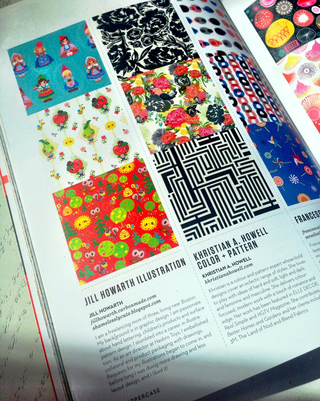
My first job out of college, was as a entry level designer for a major toy company. I had interviewed at a number of small agencies, but landed in corporate design. It's an area that is often overlooked by graphic design grads, but it gives you a great background in working with and for all the different aspects of getting a product to the market place. From R&D, to marketing, to upper management, to sales, packaging, copywriting, legal and merchandising departments...there's a lot to learn. I worked with a lot of brands and helped develop and apply styles (yes, I even did a few My Little Pony rump designs O_O). I left Hasbro to raise my family and I continually, in dribs and drabs, started doing some freelance illustration. But not "licensing." Somewhat ironic in that I did a lot of work for the Licensing department, developing kits that defined brands like MLP, Monopoly, Mr. Potato Head, Furby, etc. I was pretty good at creating patterns, motifs, etc. that expanded the brand for manufacturers to use, but my own brand? What was that? I worked to briefs, solved problems, came up with ideas. I never gave my own "brand" a second thought. 

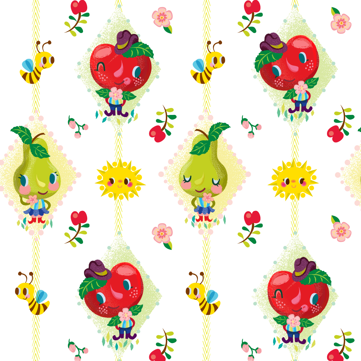
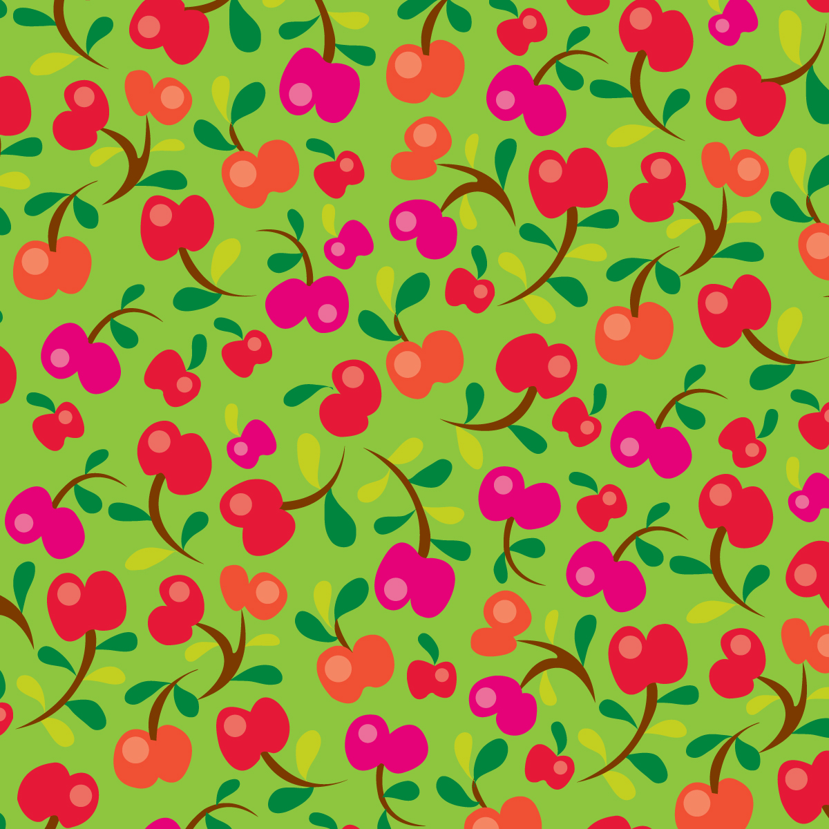
So the whole concept of coming up with art that others would be interested in, was pretty foreign. Make art that sells, do what you love... huh?!? To be honest, that still seems like a stretch at times. I decided to walk the show last year, and like so many others have said, it was completely overwhelming. So much to see, learn and process. I never had the courage to take a single peep into any portfolios, just walked around. When the opportunity arose to show with my happy happy friends, even though I felt completely unprepared, I knew it might be my best and only chance to get in. Usually the one standing on the sidelines watching, instead of logically waiting and developing an appropriate amount of work, I decided to go for it. We formally committed to a booth in January, but due to other commitments, I didn't start anything until mid-March! Not a plan I recommend to anyone! I did a lot of 'refresh' on some existing work (my motto being, it's new to you! ;) Here's an example...

This was originally a journal cover that I reformatted and did some coordinates and new lettering.

Even though I walked the show, I still didn't feel like I had a handle on what to show. This would be my biggest learning curve. I knew I wasn't a "pattern" person, but despite that, I still felt compelled to do them. That was my biggest eye opener. You don't have to do "patterns." Not that you shouldn't of course, but it's not a requirement. There were very few who came to our booth that were actually looking for them. A majority seemed to be in the market for icons that they could pull out and use. And Christmas. Bring it. You can't have enough of it. It was downright shocking to us how often we were asked for that subject. I had some, but should have had a lot more. I had heard that there would be a lot of requests for boys prints, but that didn't seem to be the case for us, at least.

Another surprise was the number of publishers present. This was great for me, since it's an area I really want to get into more. It makes sense, since NYC is kinda the publishing capital of the world, but surprising at least to me, considering it is advertised as a licensing show. Again, it's not all about pattern.

What do I wish I had done more of? Just prints and lettering in general...more that could be applied directly to the paper market. What was I glad I had? Prints with an abundant number of characters. It gives the buyer more bang for their buck. Can't have enough of that. What do I wish I had done? Send out show stopper self promos. Even if it is only to a handful of very select dream clients, if you do it well enough, you can really stand out and get noticed. Case in point...Emily's pennants! Who could resist or forget these beauties?


What was I glad I did? Show up. There's nothing like it. Where it all leads, remains to be seen, but it all went down pretty well and I'm excited about what happened and what might happen next! Stay tuned for part 2 when I talk about booth design and showing with a collective :)


Monday, April 7, 2014

uppercase :)


I finally got my copy on Friday and I must say, it still seems surreal. I submitted on a whim at the last moment, figuring I had nothing to lose and to say I am humbled at being included is a huge understatement. I had done the middle and bottom patterns as an offshoot of my second round submission for the GlobalTalent Search, last fall and the top piece was an extension from the final assignment from MATS A for giftware, as you can see below. 


I gotta say, when I look through all the pages of loveliness and then get to mine, I still get a "what does not belong here?" moment, but I'll take it. It's not flowery or super graphic in nature, but kinda goofy like me, so I guess they needed a dose of that in the issue. What can I say, but now my silly anthropomorphic flirtatious pear has now had her thirty seconds of fame, and that's a good thing :)

Monday, March 31, 2014

Lilla Rogers' bootcamp...jello?!


I have to admit, when Lilla gave us the theme for March's bootcamp assignment, my thoughts along with the general consensus of the other participants in the classroom was whaaat?? Jello... and on bolt fabric seemed like an odd fit, but like all the assignments Lilla doles out, it's up to you to run with it as you see fit. Many others focused on the intricate molds, the fun translucency of it, or gave it a tea and dessert feel, many of beautiful pieces and approaches. Here is a link to the gallery that is super fun to browse through. For me, being a lover of all things vintage kitchen (yes, I have a large collection of cookie jars, pixieware condiment containers, tablecloths, etc.) going the retro 50's vibe seemed the most natural fit for me. For whatever reason, I stumbled onto vintage tea towels on interest, which really sparked my interest. They are always fun and kitschy, and are great examples of the use of limited palettes (something I always find extremely challenging). When I saw this pretty pink western themed example, I knew I had the beginnings of my palette. I don't think I've ever used that drab green, but I really like how it plays off of the pink and raspberry colors.

After the February cuckoo assignment, I decided I wanted to maximize my final design as much as possible, so I thought of incorporating a little kitchen scene onto my presentation. Hopefully, it does not take away from the main fabric print behind it. I really enjoyed doing the limited line and fill look that I've seen used in illos from the 50's, so this was my little ode to that era. In retrospect, it looks a bit more like a cookbook cover than bolt fabric, but that's ok I guess. I added teapots, pyrex bowls, spoons, etc. because that's what I think of when in regards to making jello. 

Like lots of kids, I was raised on the stuff. My mom had it as a side and almost considered it a salad (as opposed to a dessert) for many meals. Her usual formula was to dump a can of fruit cocktail in it for added nutrition ;) I can still taste the texture of those horrible hairy gooseberries...ugh! In fact, I found this photo below as an actual example! Note that I have to be at least 5 and am still in a highchair....hey, when you have to fit 7 people into a 10' x 10' kitchen, you take any seat that's available! I was a picky eater, and apparently did not want any part of "make-your-own-sub-night!" Gotta love those knotty pine cabinets, don't you?


Sunday, March 16, 2014

uppercase??? say whaaat??!!


Yup, it's true. I have no idea how or why, but I somehow made the cut and will be in the April issue of Uppercase which will feature the surface pattern design guide. I've never been in anything! Evidently there were close to 300 submissions of which 100 were selected. I ended up submitting at the last minute, sending in two different collections that I had already done. I will be interested to see which ones actually got in. Needless to say, I am humbled to know I made it. The beautiful art of fellow MATS graduate, the talented Jan Avellana, is featured here on the cover. Congrats Jan!! If you are not a subscriber, you really should be... it's a great publication and I pour over every page as soon as it arrives in my mailbox. Better yet, act before April 30th, and you can use this code, USPDG2014, to get $15 off your new subscription or renewal. Check it out here!

Below are the 2 collections I submitted. Can't wait to see what got picked!


Sunday, October 6, 2013

took a little break from lettering


This past week, I decided to take a short break from my lettering project and work on something that I had on my to-do list. A while back, I had designed the piece below for a unicef holiday card contest. It did not make the cut, but I had since thought that I could do something more with it and possibly turn it into a pattern collection of sorts. I struggled with making the main pattern hold together, and there is perhaps more detail than what is practical to have in a bolt pattern. I added the flower pots to give it a grid and some visual stability to counter all the randomness of the windows. I generally like to come up with at least coordinates. I really liked the colors in the diamond pattern. Hopefully, all four look like they are meant to go together! 

And now...back to lettering ;)


Wednesday, September 18, 2013

pretty little maids pattern collection


A few days ago,  I showed you my little maids. I don't think I ever worked on a project for a longer period of time. I really started this during Lilla Rogers' class during her last week that focused on the gift market. The original assignment was to create a zippered pouch based on a current fashion trend of hyper lush, inkblot designs, as well as to incorporate imagery from something we collect. I have no shortage of collections, but I decided to focus on a Christmas theme, and used some German wooden flowers, putz houses and characters based on my German smokers. I had a lot of fun with it, which was the whole idea. I knew that I wanted to expand this into a fabric collection, using the little girl. Drawing more girls was the fun part, but I took the longest time trying to figure out what to do with them pattern-wise. Ultimately, I tried to keep it somewhat simple (something I struggle with...), letting them be the stars. In the end, it looks more scandinavian folk art looking than Christmas, but that's ok. I am glad to have this off the back burner! I still like the little elves and am considering more possibilities using them along with a house pattern with deer and flower coordinates? What can I say, I love Christmas!


My original pouch design, using photos of shaved wooden trees, 

plastic deer, a vinyl tablecloth pic for the "snow,"

German flowers, and 60's plastic snowflake decorations. 
A real mishmash!!

Friday, September 6, 2013

more mushrooms?!


I've never thought of myself as a surface designer, but I do enjoy futzing (is that a word?) around with patterns and making up coordinates. The main pattern above is one I did a few months back for Lilla's class. I ended up going with a different design, but I still kinda liked the color combo of this one, so I thought I would design a few coordinating pieces and voila... duchy mushrooms! Actually, I despise mushrooms, eating wise, but it was part of the original assignment and they do have a lot of interesting shapes. The "dutchy" reference is to my attempt to include a Pennsylvania dutch feel with the modified hex sign background pattern.

Hey, BTW... have you voted (for me...) in the Global Talent Search contest yet? Here's the link. Ahhh, I am so helpful and subtle ;) Have a great day!

Saturday, August 17, 2013

ok, so maybe it's not really springtime...


...but is there ever a bad time to use bunnies? Actually, I had done this bunny pattern a while back, but after Lilla Rogers class, I realized the value of having "collections" of designs, particularly when it comes to bolt fabric. So, I decided to put fall on the back burner and did a couple coordinates for the little guys... appropriately named "too many bunnies." 

Monday, June 10, 2013

Make art that sells... week 1


Well I survived week one of Lilla Roger's e-course "Make Art That Sells!" This week focused on the bolt fabric market. We first were assigned a mini exercise of drawing mushrooms followed by vintage pyrex. At midweek, the actual assignment was given of coming up with 2 patterns based on the mushrooms/pyrex along with any other retro-ish, kitchen elements. Never having been a huge fan of shrooms, I preferred the kitchen kitsch part. I tried to remember my days of combing Brimfield or the many cool antique shops in central Pennsylvania. So much fun and no end to the great inspiration, from tablecloths, pixie condiment jars, PA dutch decor... love that stuff! Anyway, I ended up submitting the first one (gray bkgd.) along with some coordinates. On to week 2!