Monday, March 31, 2014

Lilla Rogers' bootcamp...jello?!


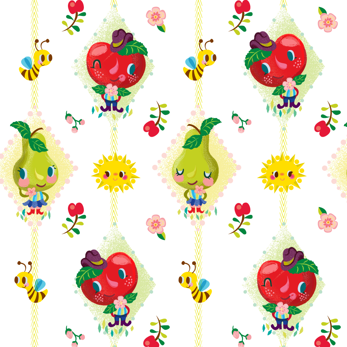
I have to admit, when Lilla gave us the theme for March's bootcamp assignment, my thoughts along with the general consensus of the other participants in the classroom was whaaat?? Jello... and on bolt fabric seemed like an odd fit, but like all the assignments Lilla doles out, it's up to you to run with it as you see fit. Many others focused on the intricate molds, the fun translucency of it, or gave it a tea and dessert feel, many of beautiful pieces and approaches. Here is a link to the gallery that is super fun to browse through. For me, being a lover of all things vintage kitchen (yes, I have a large collection of cookie jars, pixieware condiment containers, tablecloths, etc.) going the retro 50's vibe seemed the most natural fit for me. For whatever reason, I stumbled onto vintage tea towels on interest, which really sparked my interest. They are always fun and kitschy, and are great examples of the use of limited palettes (something I always find extremely challenging). When I saw this pretty pink western themed example, I knew I had the beginnings of my palette. I don't think I've ever used that drab green, but I really like how it plays off of the pink and raspberry colors.

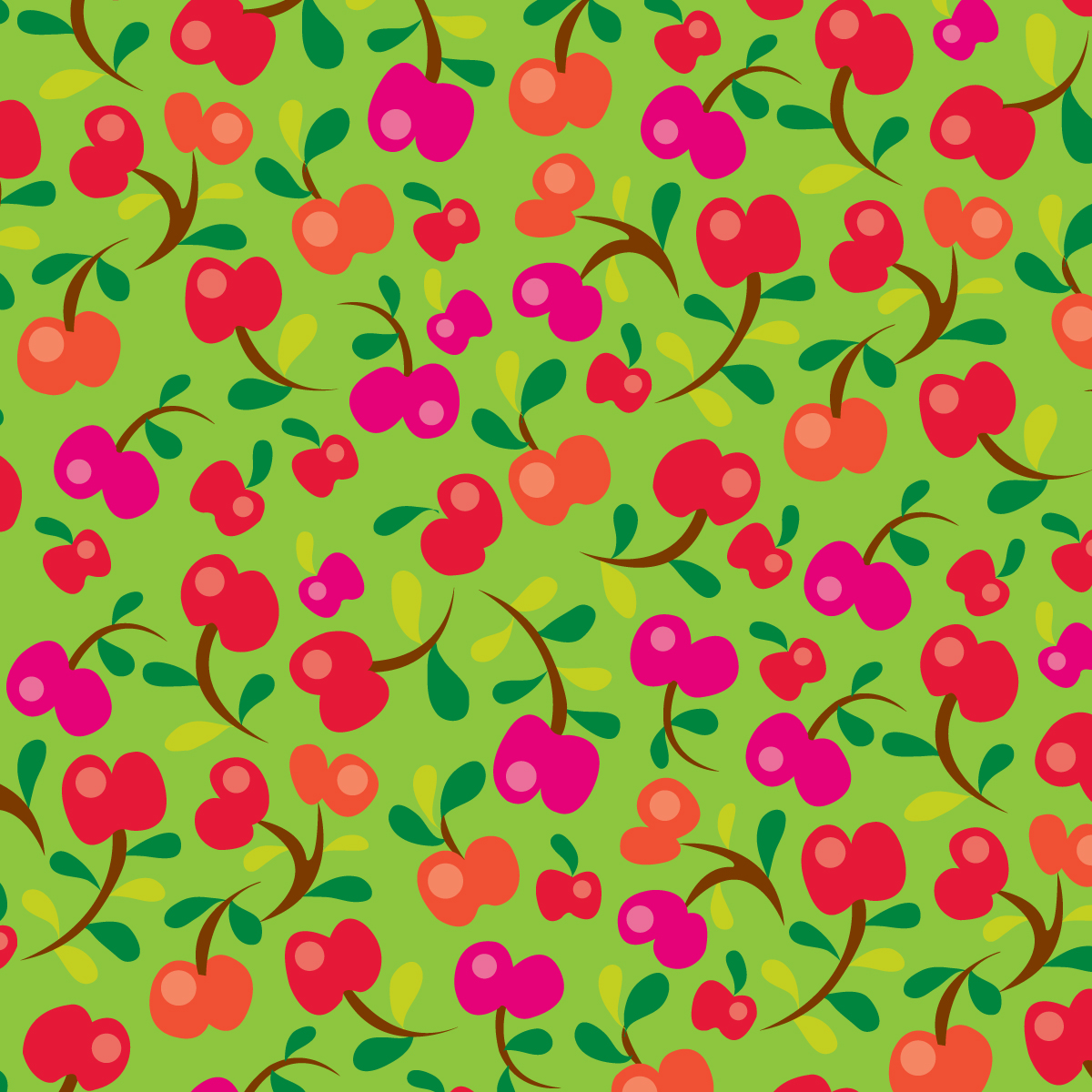
After the February cuckoo assignment, I decided I wanted to maximize my final design as much as possible, so I thought of incorporating a little kitchen scene onto my presentation. Hopefully, it does not take away from the main fabric print behind it. I really enjoyed doing the limited line and fill look that I've seen used in illos from the 50's, so this was my little ode to that era. In retrospect, it looks a bit more like a cookbook cover than bolt fabric, but that's ok I guess. I added teapots, pyrex bowls, spoons, etc. because that's what I think of when in regards to making jello. 

Like lots of kids, I was raised on the stuff. My mom had it as a side and almost considered it a salad (as opposed to a dessert) for many meals. Her usual formula was to dump a can of fruit cocktail in it for added nutrition ;) I can still taste the texture of those horrible hairy gooseberries...ugh! In fact, I found this photo below as an actual example! Note that I have to be at least 5 and am still in a highchair....hey, when you have to fit 7 people into a 10' x 10' kitchen, you take any seat that's available! I was a picky eater, and apparently did not want any part of "make-your-own-sub-night!" Gotta love those knotty pine cabinets, don't you?


Wednesday, March 26, 2014

happy happy alphabet... time for the letter I!


If you've been following along, the wonderful artists of the happy happy art collective have all been working on a group alphabet project. We have a set palette, and each letter is being interpreted by 2 different artists. I was assigned the letter I. I didn't think much about it at the time, but it turns out that it's a pretty limited letter, word-wise! In fact, I'd rank it right up there with the letters X and Z. To make it more fun for myself, I've been writing little alliterative descriptions for each letter I do and with this one, I had to rely on some verbs, because the noun selection was pretty thin. You can read my little ditty here. Actually, I was going to do an inchworn pushing her ice cream eating infant on an island in front of an igloo, but when the super talented Emily Balsley did her letter I with an inchworm, I had to rethink. I think you'll agree, she did a fabulous job! Don't you just love those sneakers?


I've never been a huge fan of iguanas but, it was about the only animal/ character that I thought would be at least semi recognizable, so I went with it. Of course, despite the fact that it's a lizard, I had to try to make him cute! This piece evolved a lot from my initial little sketch. I really had to move elements around and play with scale to try to make it work. You can check out the progress of our alphabet so far right here in our happy gallery!

Tuesday, March 18, 2014

jack & jill


Every month, the girls at happy happy art collective have a different group project. It's always fun to see how each artist has a different take and and how the final pieces turn out. You can see Emily's and Lauren's takes here, and check back there later in the month for Tammie, Denise and Muffin's versions. 

March's assignment was to illustrate a book cover for the nursery rhyme, Jack and Jill. Being a namesake from the title, I've had those verses drummed into my head since childhood, not to mention, always being asked, "where's Jack?" Everyone thinks they are being soooo original ;). Like all nursery rhymes, this one has kind of a dark, odd, pointless underlying message. Why did he fall? Why didn't Jill try to help him? Why didn't she learn from his mistakes but instead, fell right back down, too? And I'm not even going to mention the first aid technique of vinegar and plaster... Anyway, having pondered this little ditty for many years, I decided to turn it into a toddler "self help" book, kind of like Dr. Phil meets Dr. Spock. Hmmmm, maybe I'm the one who needs to be in analysis, ha.

As always, I knew that I wanted to play up the title, because, well that's what I'm comfortable doing. So, I started by filling the space with the hill itself, and filling the hill with the title. I noticed how the hook of the "J" stuck out a bit, so this seemed like a natural thing for clumsy Jack to trip on. As far as color, I started out wanting to make it a limited palette, but I'm not usually very good at sticking to that. My inspiration for color came from this vintage piece by dutch artist Willy Schermele. I love her work! So sweet and she does so much with just a few colors...something I long to improve on, but I have little self control when it comes to my swatch panel in illustrator. If you are interested in any WIP screen shots, I included them in my post over at happy happy

Have a great day and be careful fetching those pails of water!!

Monday, March 17, 2014

happy happy st. patrick's day!


Hey, it's not too late to give your favorite irish-loving cat-centric friend (and don't we all know at least one?)  some St. Patrick's day love! Get this freebie printable over at happy happy art collective!

Sunday, March 16, 2014

uppercase??? say whaaat??!!


Yup, it's true. I have no idea how or why, but I somehow made the cut and will be in the April issue of Uppercase which will feature the surface pattern design guide. I've never been in anything! Evidently there were close to 300 submissions of which 100 were selected. I ended up submitting at the last minute, sending in two different collections that I had already done. I will be interested to see which ones actually got in. Needless to say, I am humbled to know I made it. The beautiful art of fellow MATS graduate, the talented Jan Avellana, is featured here on the cover. Congrats Jan!! If you are not a subscriber, you really should be... it's a great publication and I pour over every page as soon as it arrives in my mailbox. Better yet, act before April 30th, and you can use this code, USPDG2014, to get $15 off your new subscription or renewal. Check it out here!

Below are the 2 collections I submitted. Can't wait to see what got picked!


Thursday, March 13, 2014

40 days of lettering... day 32


Day 32 is a piece I did for an interview with Kory Kennedy, design director for Entertainment Weekly. You can read the full article here. Evidently, Kory is a big fan of illustration and type, so I couldn't pass up the chance to do something from the article.

I wanted to make a playful piece, and knew that FUN was the key word to play off of in the actual quote. I messed around with some sketches, when I noticed that the serif on the "U" might be able to be transformed into a foot or boot, giving its neighbor, the capital N, a little kick in the pants. That became my starting point. From there, I messed around with some "glyphy" descenders on "typography" until I came up with something I liked. Then came color. Usually, I have a vague idea in my head where I want to go with color and it ends up being my favorite part of making the final. In this case, I was all over the place! I tried all sorts of palettes and even went so far as the little pink number here. I'd like to say I went all the way to crazytown on this one. Sometimes, you have to go there and come back to get your sanity check. I think I was trying too hard to make it fun, and ended up with a circus on my hands! Anyway, I thought better of this color combo, and returned to a red/blue solution, that I thought was probably fun enough, although in looking at the crazytown version, I'd like to use these colors on something, at some point, like maybe something for a circus? ;) Did I make the right decision? What do you think?

Tuesday, March 4, 2014

how many f-words can you find??


ok, so that didn't come out right. So much for my career as a children's book author! This is my latest contribution to the happy happy art collective's alphabet series. Head on over to the blog to learn more about Frantz, the fox and see the rest of the letters so far! Here's the link!

Monday, March 3, 2014

Lilla Rogers' Bootcamp... gone cuckoo!!


Month one in Lilla Rogers' Bootcamp has come and gone, along with February, so I thought I'd give you a quick recap! First of all, I wasn't sure at first whether or not to sign up for this course, but somehow I knew that once I started seeing all the beautiful pieces coming in, I knew I would want to get in on the action. I work better with a brief anyway, and bootcamp is a more affordable option to Lilla's classes. If you have been on the fence about taking one of her MATS classes, this is a good opportunity to get your feet wet. The schedule is much more spread out, with a week for the mini assignment and then 2 weeks more to develop the final and upload it on the gallery on her studio site. In MATS, you have less than a week to do the same thing, so time seemed like a luxury.

Being a natural born procrastinator, no surprise I abused the time frame and essentially did it in a week, but somehow, it seemed far less stressful than MATS. I actually really liked the subject matter of cuckoo clocks! Being a collector of all things cute, german and wooden (a.k.a. smokers, wendt & kuhn flower children, angels and various other bavarian kitsch) , it appealed to me. We had a cuckoo clock in my house growing up. Can't imagine having one now with the chiming and cuckooing in the half hour, but you do get used to it. 

here's a little peek at my WIP in illustrator. I did everything in it.
The challenge came in when Lilla defined the end piece as a cell phone case. Cuckoo clocks are loaded with rich details, so it was hard to imagine how it would all translate well down to a such a small format. I played around with some different ideas, like turning it into a skyscraper type condo bird house, not unlike the ones you can buy for purple martins, or possibly making a city scape out of different clocks/houses, but in the end, I decided to focus on the birds. My thinking was that it might be a good way to fill the vertical space of a phone case and besides, birds are cute and fun to draw. As far as style, I went for a symmetrical folkloric look, kind of like the party paper assignment at the end of MATS B. What can I say, I'm a sucker for symmetry ;) It was fun to try to give some of them a little personality. 

The gallery of over 400 cuckoo cell phone cases is amazing. A ton of great pieces, so if you have the time, check it out here.  Enjoy!!